Mike has taken the electoral vote map from Electoral-Vote.com and modified it so that states are as large as their number of electoral votes:
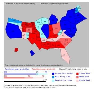
Certainly gives you a different perspective!
Mike has taken the electoral vote map from Electoral-Vote.com and modified it so that states are as large as their number of electoral votes:
Certainly gives you a different perspective!
 This work is licensed under a Creative Commons Attribution-NonCommercial-ShareAlike 4.0 International License. Copyright P. Kerim Friedman.