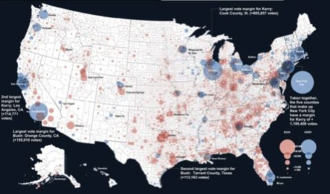
Red vs. Blue have you down?
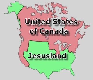
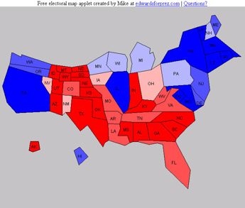
Here are some other ways of looking at the results.
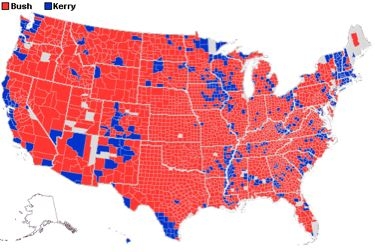
By county (I don’t have time to make a picture of it, but I especially like the “popular vote by population” version of the map):
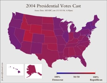
Or in subtle shades of purple:
(via BoingBoing, and Ishbaddidle)
See other map posts here, here, and here — but especially here.
UPDATE: Derek points me to this excellent NY Timesinteractive graphic (I especially like the “Vote by Population” graphic, but I didn’t have time to make a picture.):
UPDATE: Francisca points to another NY Times interactive graphic.
