I was surprised by Sin City. I thought I would be bored by the story but enjoy the visuals. After all, so much had been made about how brilliantly (and literally) Rodriguez had adapted the imagery of Frank Miller’s comic book to the screen.
My experience was the opposite: I enjoyed the narrative, which (despite its flaws) kept me glued to my seat, but was bored by the visuals.
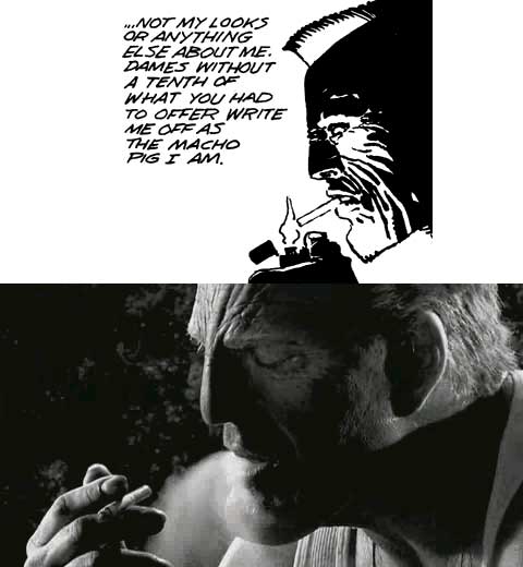
I think there are two reasons for this. First of all, not all black and white is the same. One of the most beautiful black and white movies of recent years was the Coen Brothers’ The Man Who Wasn’t There.

It was actually shot in color, and there is supposedly a European release DVD with a copy of the film in color. Cinematographer Roger Deakins explains why they shot it that way:
I wanted to have more tonal range than a lot of old American film noirs. The Alan Ladd/Veronica Lake movies, they’re quite bold, the mid-tones are reduced, very black and white. In this, I wanted to use a wider palette. When we go to the jail and Billy Bob is talking to Fran across the table; I wanted it to be sort of a pastel grey look rather than strictly black and white. I wanted to be able to create a lot more different looks than you find in the John Alton films.
By shooting in color and converting to black and white, Deakins was able to get a silvery quality that is unlike anything I’ve seen in any movie. Sin City, by contrast, was, well … contrasty. But not in a good way, just flat and uninteresting. I think the fact that it was shot against a blue screen and they relied heavily on back-lighting to give depth to the frame made it look even more flat and boring — unlike the dynamic and interesting use of monochrome in the comic book. Film is different than print, and needs to be handled differently.
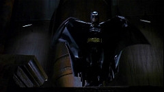
The second problem is that there is a big difference between the dynamic cinematic image and the stillness of a comic book frame. In a film you want something interesting to develop in the frame. That’s what holds your attention. Its what makes Kung Fu Hustle so much fun — there is always some new visual pleasure about to burst forth on the screen. But when you make the images so comic book like, so flat, you work against the nature of the medium and deprive the audience of that pleasure. It was only in the action scenes, when splashes of white, red, or yellow blood gave a Jackson Pollock abstractness to the image that the image became more interesting. Compare this with Tim Burton’s approach to Frank Miller’s Batman, in which he translated Miller on to the screen, rather than just rendering him literally.
Praising Rodriguez for being so literal in his filmic interpretation is like praising a writer for providing a literal translation of a poem. It might teach you something about the original poem — but it doesn’t make for good poetry.
(Some of this was talked out with Shashwati after viewing the film.)
UPDATE: Shashwati just found this review by J. Hoberman:
Sin City aspires to be a living comic book and it certainly has a look. Everything from Marv’s iridescent bandages to the wounds that explode like Day-Glo bird shit is a design element. The filmmakers have taken evident pains to approximate Miller’s aggressively stark high-contrast palette—no shades of gray—and fondness for dynamic, receding planes. But movies are not comics, and once the shock of recognition wears off, this literalism has an oppressively overwrought effect—not unlike the hyper-real Plan Nine reconstruction in Tim Burton’s Ed Wood.
{rodriguez, batman, sin city, burton, deakins, <a href=“http://technorati.com/tag/man who wasn” onclick=“_gaq.push([’_trackEvent’, ‘outbound-article’, ’http://technorati.com/tag/man who wasn’, ‘man who wasn’t there’]);” t there” rel=“tag”>man who wasn’t there, black and white}
