I’ve been spending some time this morning looking at different ways of charting electoral votes:
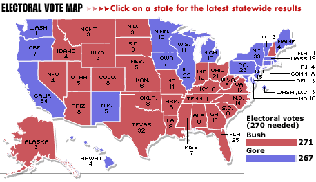
- The traditional “red and blue” map, showing electoral votes by state for the 2000 elections (related article):
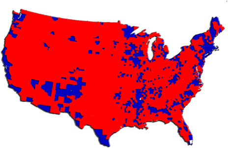
- A red and blue map of the 2000 elections by counties:
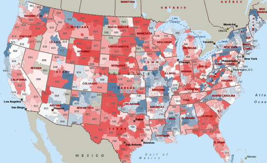
- A map showing “money contributed as a proxy for votes” for the 2004 campaign, also red and blue by party.
Here is an excellent site showing even more breakdowns than above, including historical maps of past elections. (Note, red and blue are switched on this site, so blue denotes Republicans.)
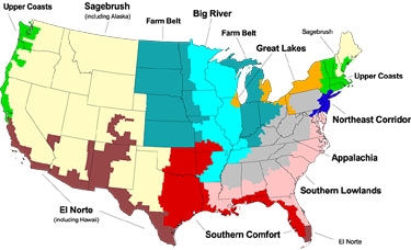
- But this is my favorite (via Ishbadiddle), it takes a very different approach, looking at demographics rather than voting districts. (Here is an overview article explaining the approach.)
This last map (#4) shows that things are much more subtle than the urban vs. rural divide suggested by the county map (#2) and the USA today article accompanying map #1:
Electoral votes follow state boundaries, but populations don’t, and the social characteristics that influence politics spill over jurisdictional lines. Rural sections of adjacent states often have more in common, culturally and politically, with each other than with the urban and suburban population centers of their states. If political campaigns can translate media markets into electoral votes, why not regional identities that cross state lines? Furthermore, upstate-downstate divisions are well-established dynamics in elections for statewide offices, such as governor and US senator. Why should it be a surprise that they play a role in the Electoral College tally for president?
That role becomes clear in CommonWealth’s analysis of recent national elections (See “Continental Divides”): No winner of a presidential election has carried fewer than five regions in at least three decades. But it’s especially clear in the razor’s edge closeness of the 2000 presidential election: George W. Bush and Al Gore each won five regions, but it was Bush’s hair’s-breadth victory in Southern Lowlands that carried the day.


