Years ago I had a vision of what my ideal world news web site would look like. Well, it still isn’t there, but several sites now come close enough that I can provide examples.
The problem is that interesting news is happening all over the world, but the focus of the US media tends to be on those stories which most concern America. (Ethan Zukerman’s Global Attention Profiles maps provide show which countries the blogsphere considers to be important.) How then to get a sense of what other countries consider important?
It is difficult to do this because it would require translating local newspapers from hundreds of languages into English (since I don’t speak hundreds of languages). It would also require sorting the news into various categories (politics, sports, technology, etc.). And then putting it into some kind of a map format. The idea being that we could be alerted quickly if suddenly a lot of news stories were being written about politics in Kenya, or Spain’s economy. Right now, I’ve found the best way to do this is to subscribe to some bloggers who track news in various parts of the world, but I still have hopes for my original idea of a graphical interface. Below are the three best approaches I now know of.
First of all, most of us already know about Google News:
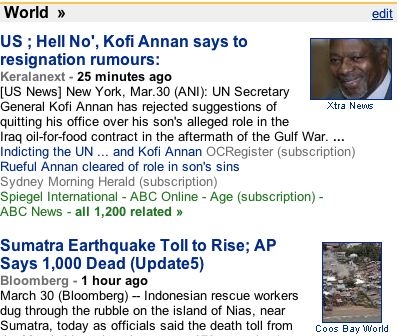
This doesn’t do anything interesting graphically, but it is highly customizable, and allows you to draw feeds from a few different language sources if you like. It certainly gives you a less filtered view of world news than what you would find in the New York Times, but the problem is that the “top stories” listed here are pretty much the same as what you’d find anywhere. Because it is a ranked list, and not a map, you don’t really get the kind of global spread I am looking for.
Next up is News Map:

If you select “all countries” at the top and choose “nation” at the bottom, you get a view of the top news stories in each of about a dozen nations. This is nice, but quite limited. You don’t get many countries, you can’t really read any of the headlines in some countries because they appear so small on the screen. And you are limited by your own knowledge of the various languages, since stories all appear in the official language of each country.
This brings us to EOGEO.
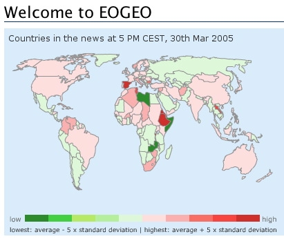
This is the closest I’ve seen yet to my ideal. Although it doesn’t let you sort by category (a major limitation) you can quickly see at a glance what countries have an unusual burst in news activity. For instance, looking at today’s map I see that Ethiopia and Spain both have unusually high news activity. I can then see a pop-up RSS news feed for those countries (selecting what languages I wish to see). I discover that an Israeli politician apparently attempted suicide in Ethiopia, and that Spain is selling arms to Venezuela. Neither of these stories appeared on the top page of Google News, and it was hard to find them on News Map. On the other hand, it strangely misses some major stories, such as the rising death toll from the earthquake in Sumatra.
My ideal map would combine all three of these. It would be customizable, giving you a selection of languages and news categories. It would be graphical, with a world map (perhaps including icons for various news categories, so you can see if the reason that South Africa is suddenly making a blip in the news has to do with cricket or AIDS). And it would draw on a global array of news sources so that you can see what stories are important around the world, not just according to Americans or Europeans.
(EOGEO link courtesy of The Map Room.)
