The upgrade redesign of Keywords is now complete. Like I said, the new system should allow me to change things even more in the future, and maybe even offer a variety of themes depending on user preferences. However, I could use some feedback on the new design, since I want to make sure it looks decent across all platforms and browsers.
Here is what it looks like on my computer (click for a larger image):
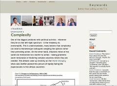
If you notice anything radically different from this, please let me know! General feedback is also welcome.
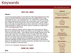
For those new here, this is what it used to look like:
UPDATE: One thing that is driving me crazy is that on the main index page URLs are not wrapping, while they are on the individual archive pages. I have no idea why! Anyone?
UPDATE: Check out the new zeitgeist page! (Powered by the Heat Map plugin.)
UPDATE: I’ve redirected my feeds to all run through Feedburner (except for category and comments feeds). Let me know if you notice anything strange!
UPDATE: I’ve implemented changes in response to some of the comments, as well as adding a section on my side bar with links to comments I’ve left on other people’s blogs.
{web design, wordpress, blog, theme, css}
